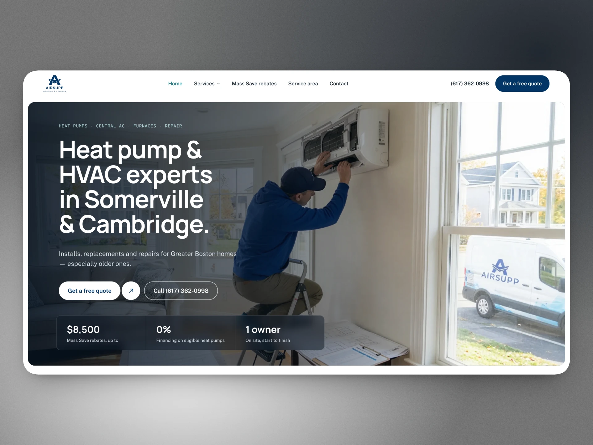
Unclear offer
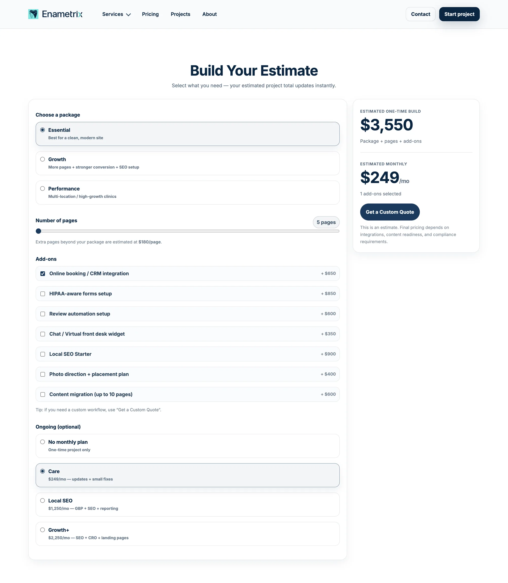
7 service pages, 3 packages, 7 add-ons and 3 monthly plans. Too many decisions for a busy dentist.
Enametrix is my own studio. I repositioned it around what dental practices actually need, then redesigned and rebuilt the site from Webflow.
Offer 13 options → 4 services + 1 audit Stack 4 tools → 1 codebase
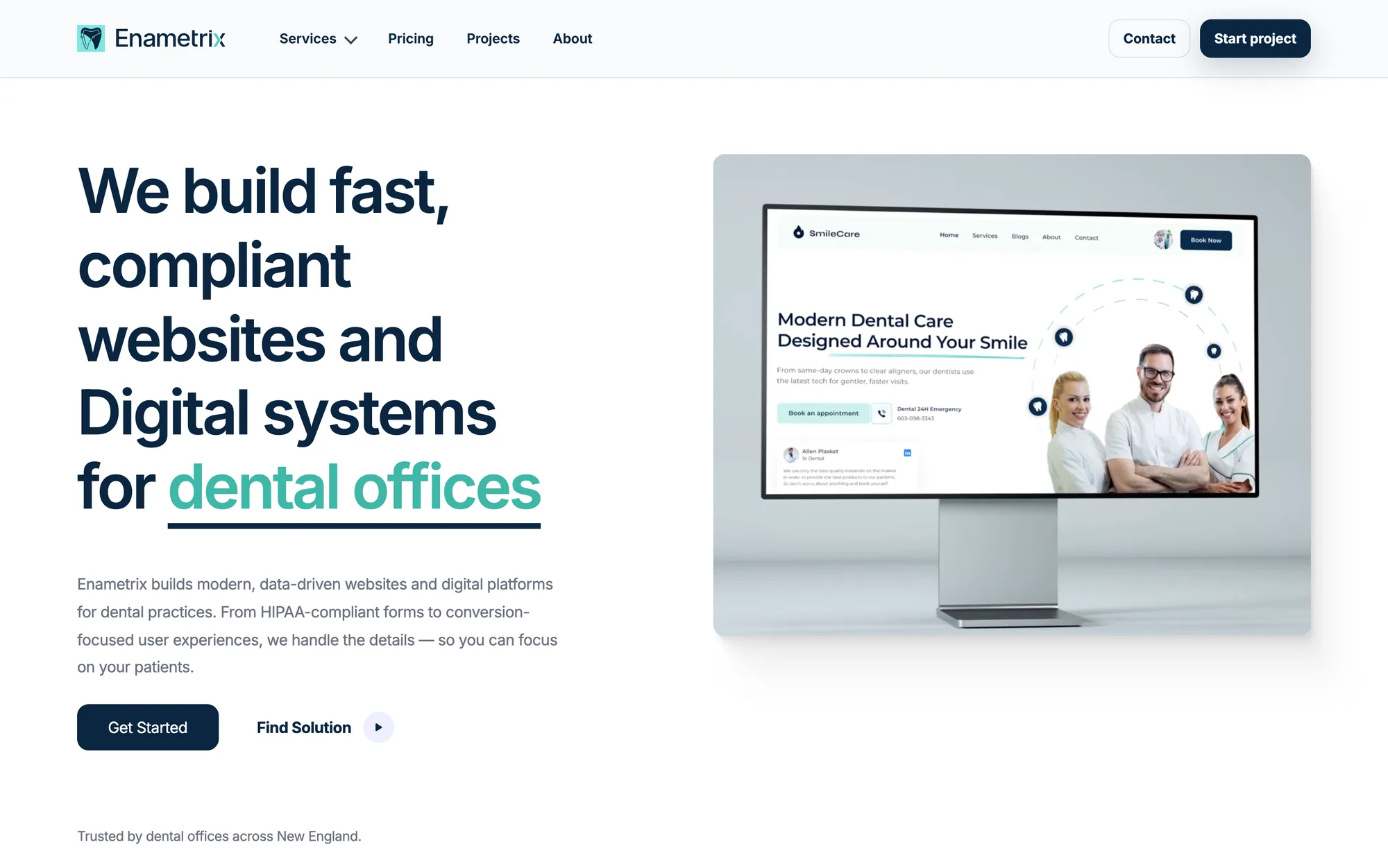
Enametrix is my studio for independent dental practices in the Boston area. It builds websites with online booking, missed-call text-back and review automation built in.
The first version ran on Webflow. It looked fine, but it sold everything (websites, SEO, IT, cybersecurity, HIPAA) to everyone, with no clear reason to choose it.
So I treated the rebuild like a product project: research first, then positioning, design, build and launch.
7 service pages, 3 packages, 7 add-ons and 3 monthly plans. Too many decisions for a busy dentist.
As a new studio I had no clients yet, so the site had to earn trust honestly.
12 Webflow forms routed through a Cloudflare Worker, Formspark and Zapier. Hard to maintain, easy to break.
I started with industry data, not with layouts.
Only 24% of dentists say they aren’t busy enough, 41% say they’re too busy, and nearly 9 in 10 struggle to hire hygienists. “More patients” alone wasn’t the message.
Source: ADA Health Policy Institute, Q2 2026
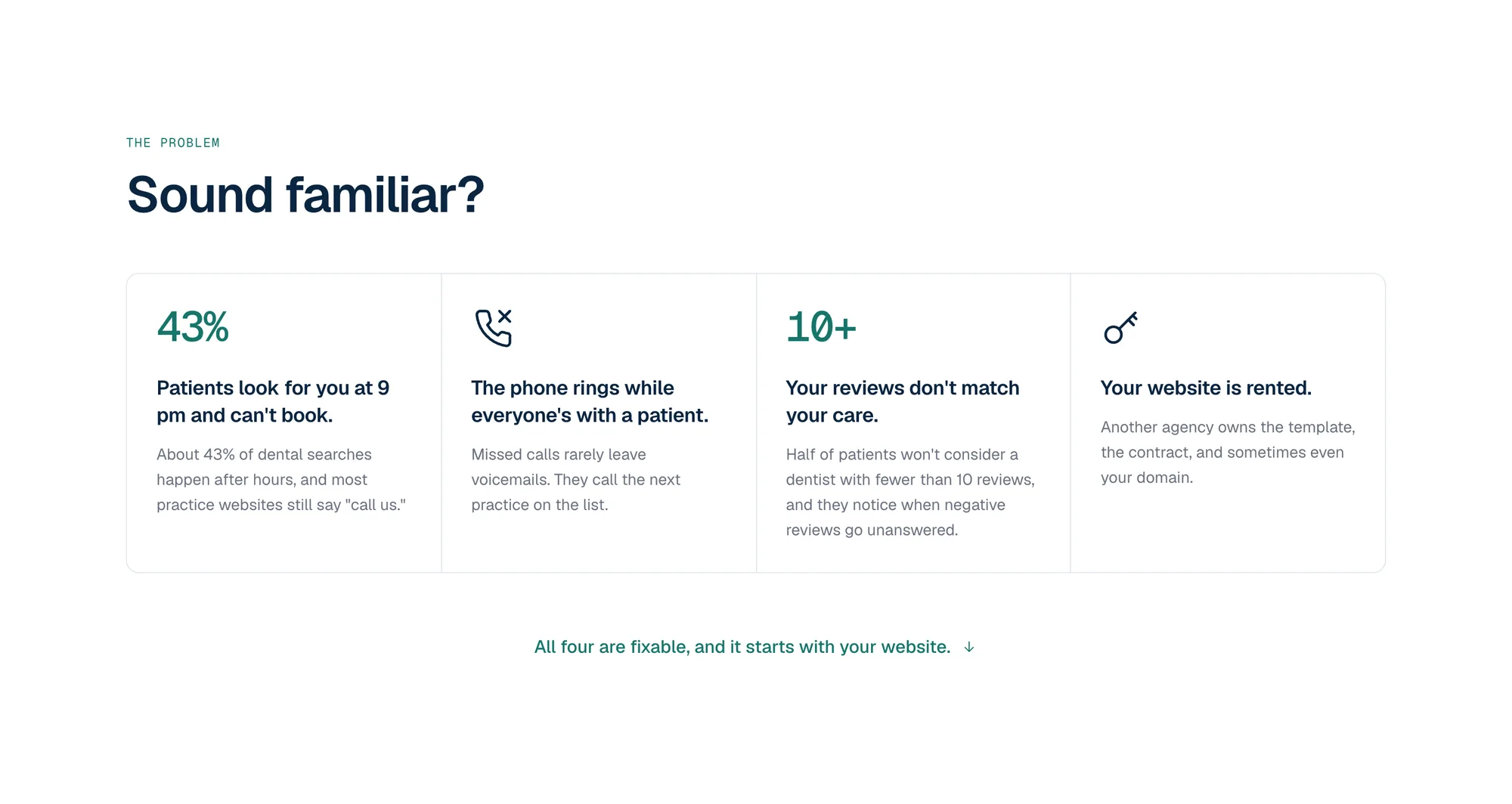
They choose by reviews and convenience, often outside office hours, while most practice sites still say “call us.”
The common complaints: rented websites, long contracts, account managers and cookie-cutter templates.
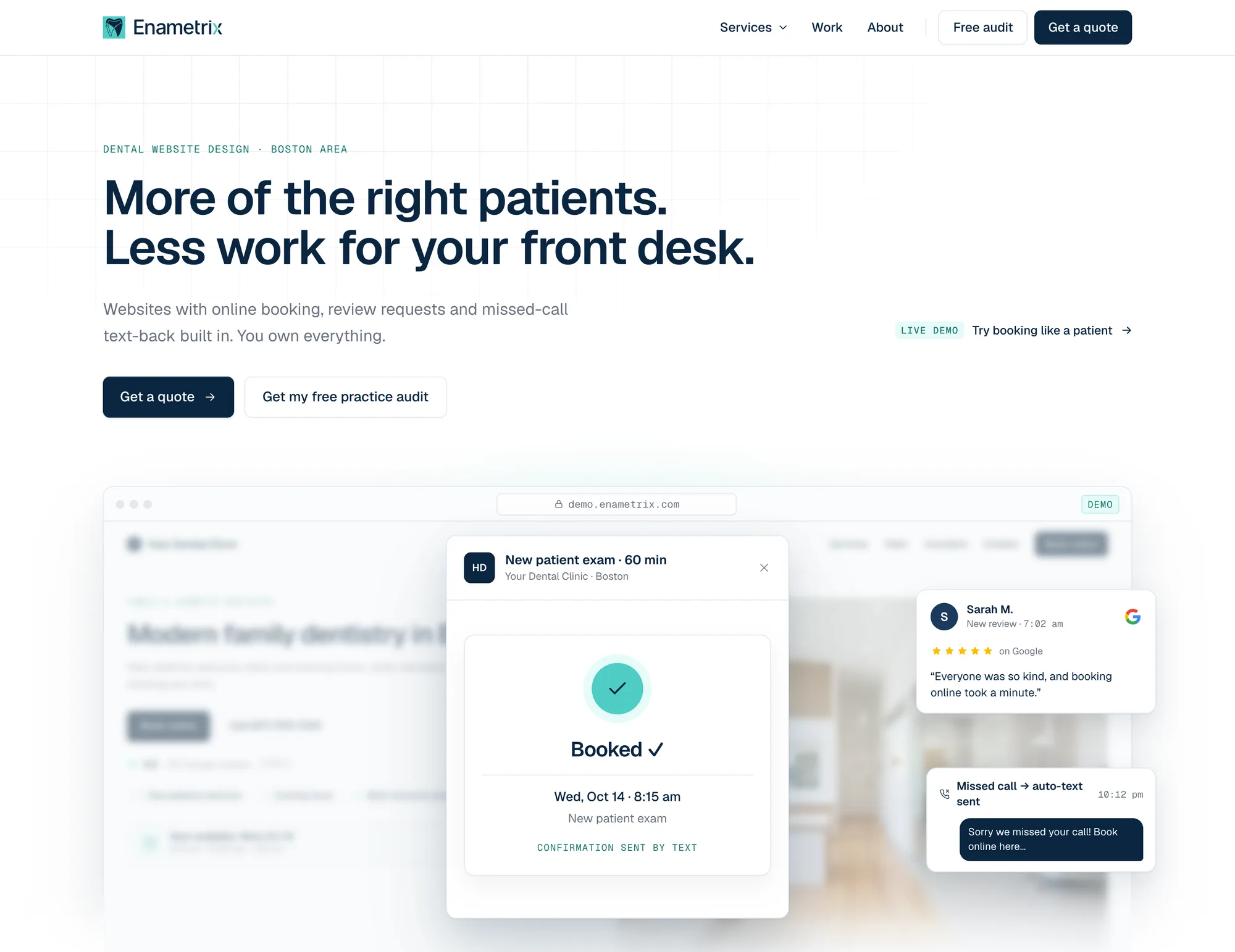
“More of the right patients. Less work for your front desk.”
I cut the offer down to four services with a single entry point: a free practice audit.
13 options
Plus 7 service pages.
4 services + 1 audit
Entry pointFree practice audit
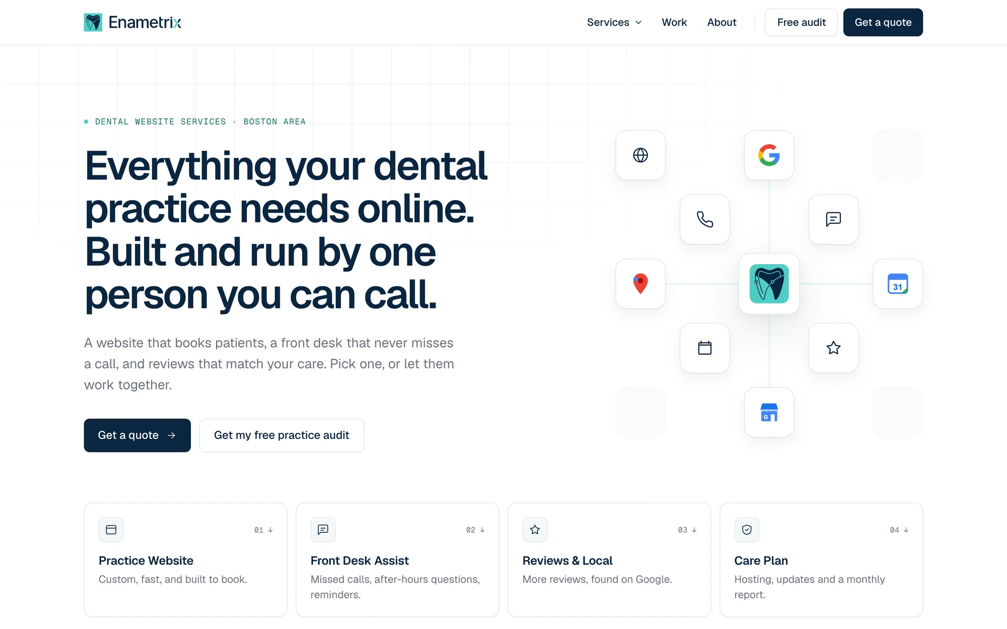
I explored several directions before landing on a Linear-inspired light theme. Dentists are used to bright websites, but I wanted the same level of craft: big, tight Geist type, hairline borders, one restrained accent and the product shown as polished UI instead of stock photos.
A browser window shows a sample practice site with an animated booking flow (date → time → “Booked ✓”) and floating cards for missed-call text-back and new reviews. One iteration looked too much like a SaaS dashboard, so I reworked it to make the website the hero.
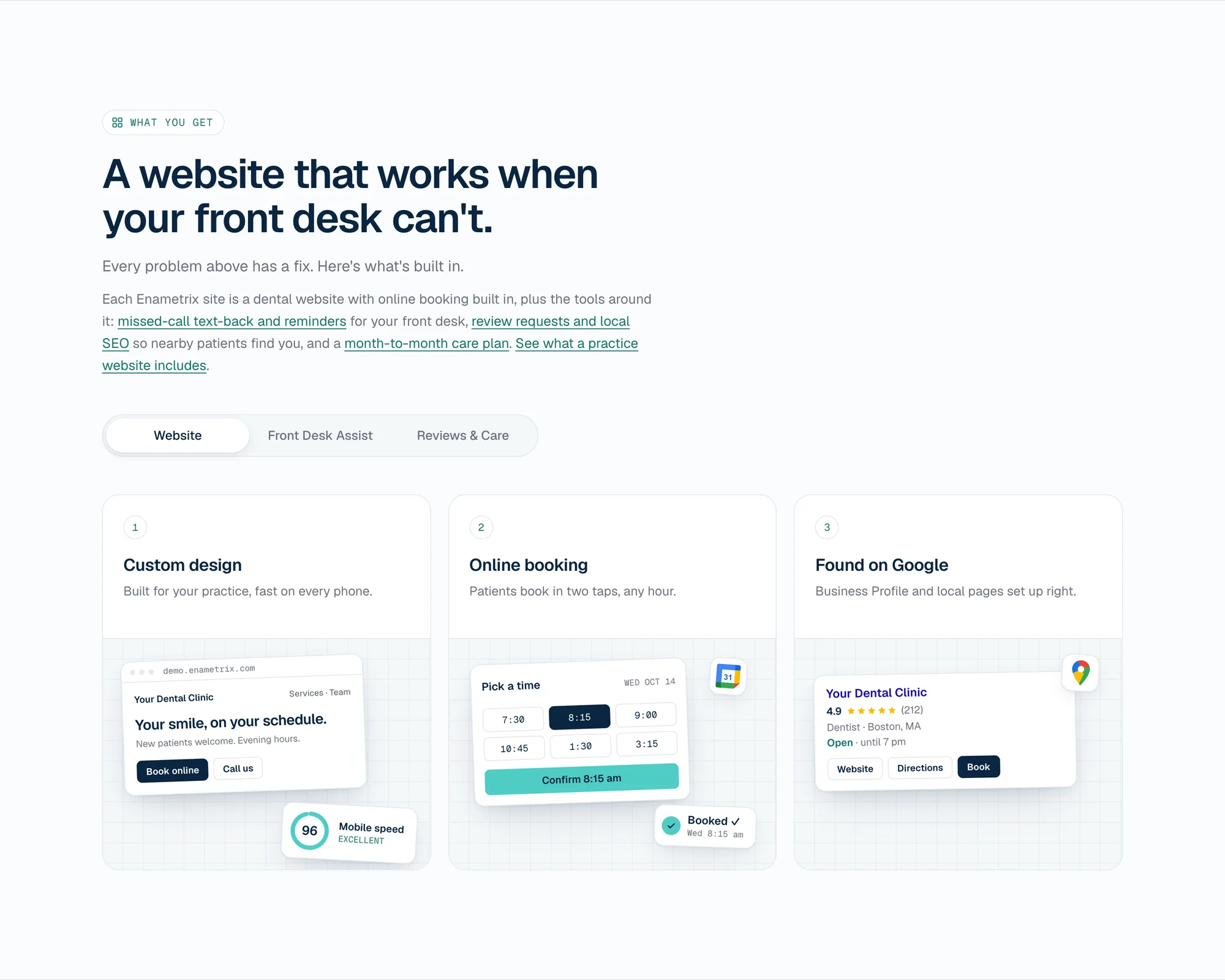
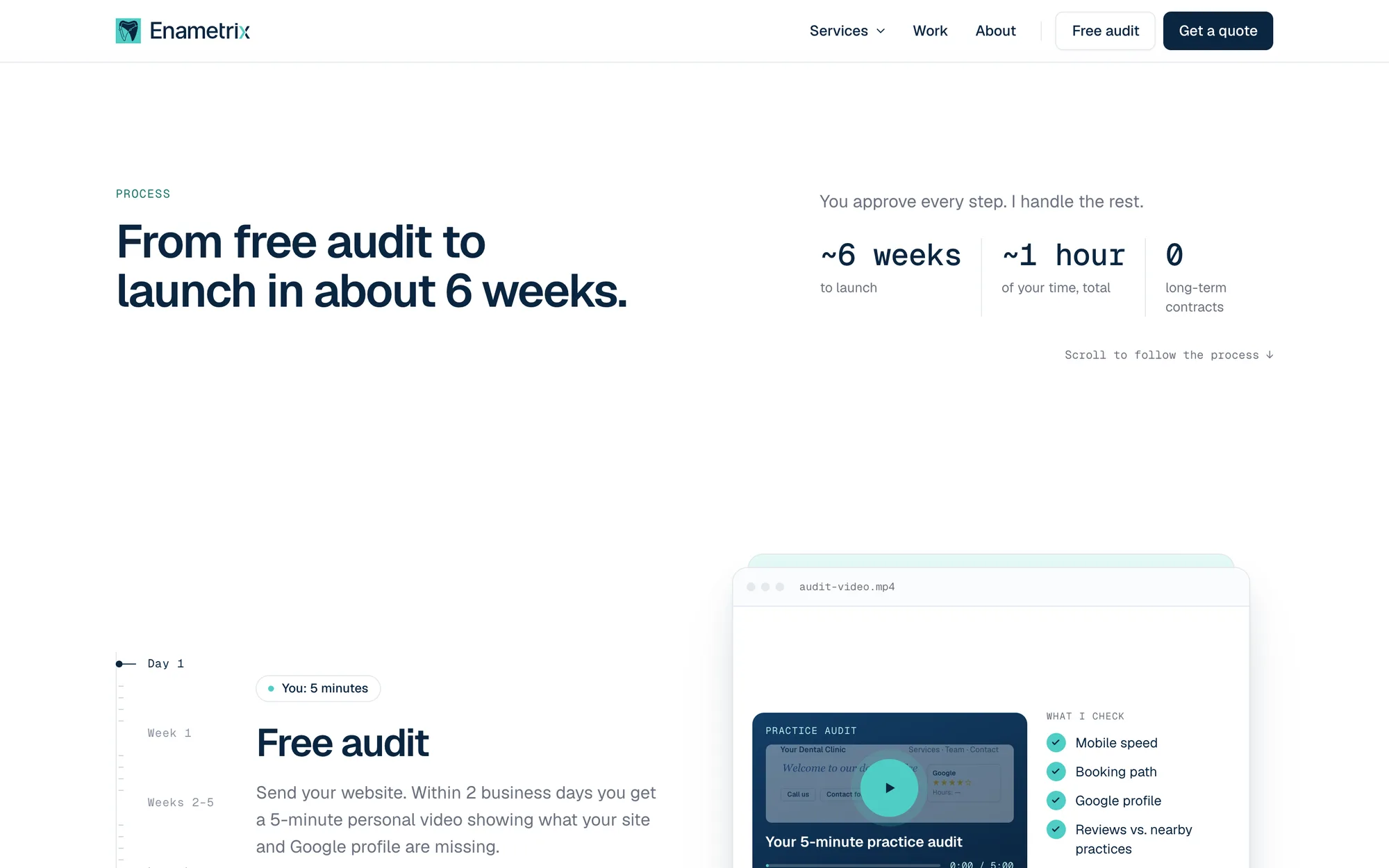
Problem cards (“Sound familiar?”) lead into tabbed service cards with mini UI stages. A sticky-scroll process timeline (Day 1 → Launch) is followed by a founder section and an FAQ.
No fake testimonials, client logos or invented stats. Mockups use a fictional “Your Dental Clinic,” concept projects are clearly labeled, and statistics cite their sources.
Hand-written HTML, CSS and JavaScript on Vercel, with one serverless function for leads.
llms.txt file for AI search, and Core Web Vitals tuning.
One Vercel function handles every request in this order. HubSpot is best effort, so a CRM outage never loses a lead.
After: One codebase on Vercel
Lighthouse scored 100 on mobile across Performance, Accessibility, Best Practices and SEO.
| Lighthouse | Mobile | Desktop |
|---|---|---|
| Performance | 100 | 100 |
| Accessibility | 100 | 97 |
| Best Practices | 100 | 100 |
| SEO | 100 | 100 |
| First Contentful Paint | 1.0 s | 0.3 s |
| Largest Contentful Paint | 1.7 s | 0.4 s |
Google PageSpeed Insights, enametrix.com home page, October 2026.
The research changed the headline, the offer and the page structure more than any design decision did.
Without clients yet, every element had to build trust without faking it: labeled concepts, cited stats, illustrative mockups and a real founder story.
Claude Design for exploration, Claude Code for implementation, with a CLAUDE.md of tokens, content rules and conventions keeping the output consistent.
Tell me what you’re building. If I’m not the right fit, I’ll tell you that too.
or email hi@klep.dev