OTC
Creates liquidity for over-the-counter transactions.
Nexen automates liquidity management in a volatile crypto market. I shaped how it looks and works, from the logo and UI kit to the web and mobile app and the posts that promote it.
Scope brand → design system → web & mobile app → marketing
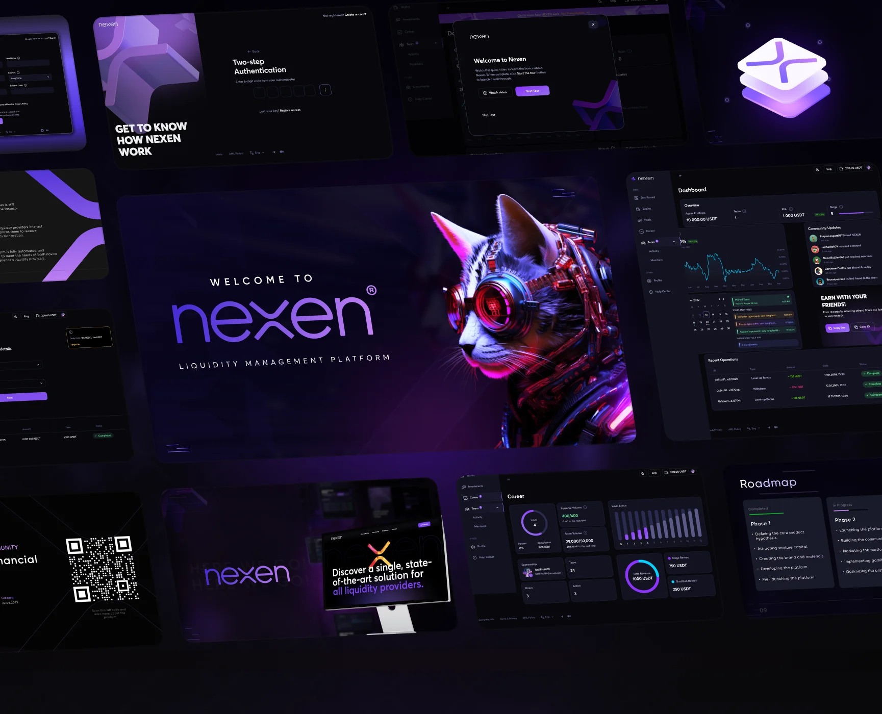
Nexen is a fintech platform that automates liquidity management in the cryptocurrency market. It analyzes market data, adapts to volatility and rebalances crypto portfolios in real time.
I joined as Senior UX/UI Designer and UI Developer. My job was to give a complex financial product one clear, consistent face: the brand, the design system, the web and mobile app, and the marketing around it.
Nexen brings four liquidity products under one account.
Creates liquidity for over-the-counter transactions.
Provides liquidity to market makers and crypto projects.
Works with liquidity pools on decentralized exchanges.
Adds liquidity for transactions between blockchain networks.
Pools, APR, staking and rewards had to be readable for newcomers without slowing down experienced users.
In crypto, a product has seconds to look credible. The brand and UI had to feel secure, precise and premium.
The web app, mobile app, presentations and social posts all needed to look like the same product.
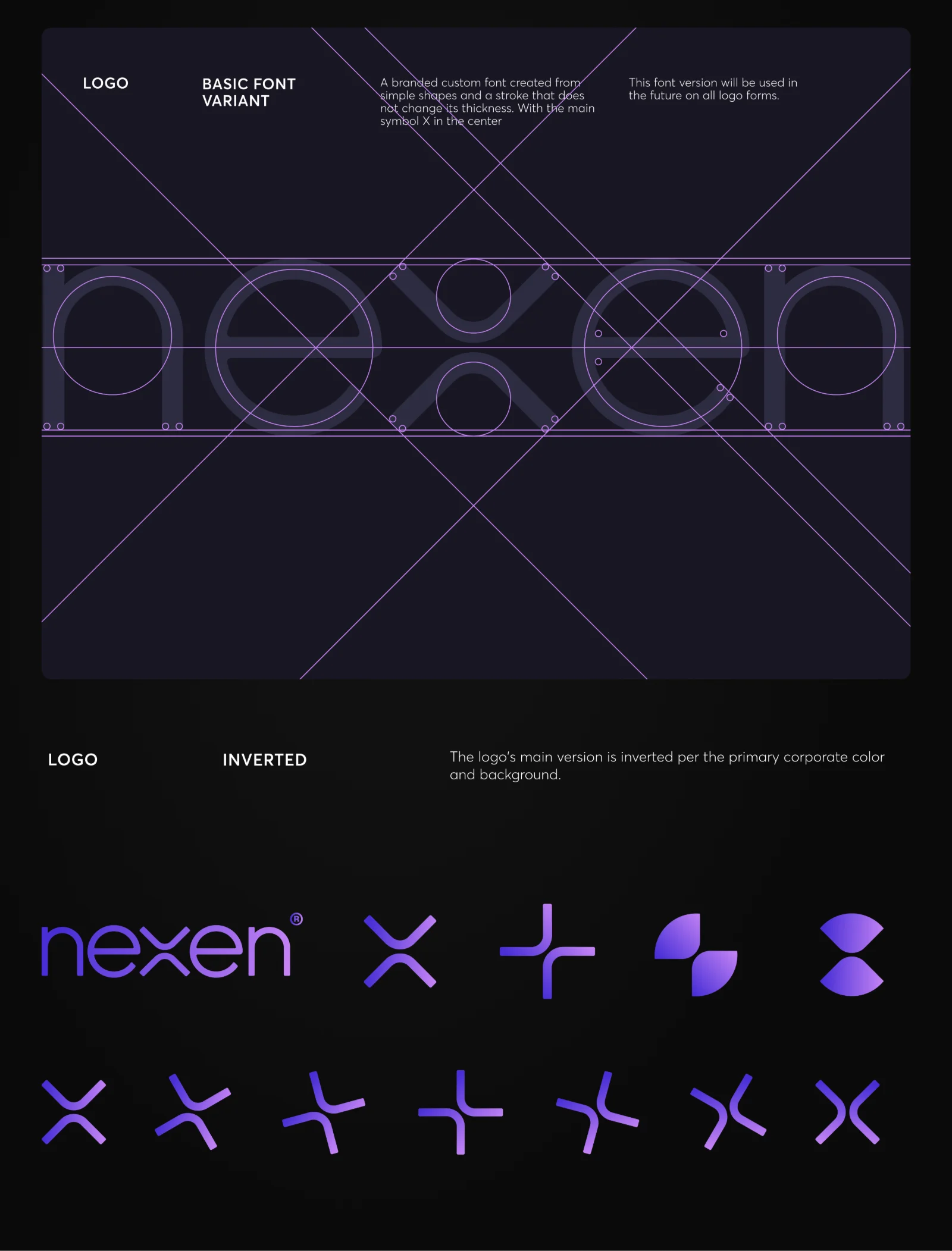
A custom wordmark drawn from simple shapes and a stroke that never changes thickness, with the X at its center. The X then becomes a family of marks for icons, avatars and graphics.
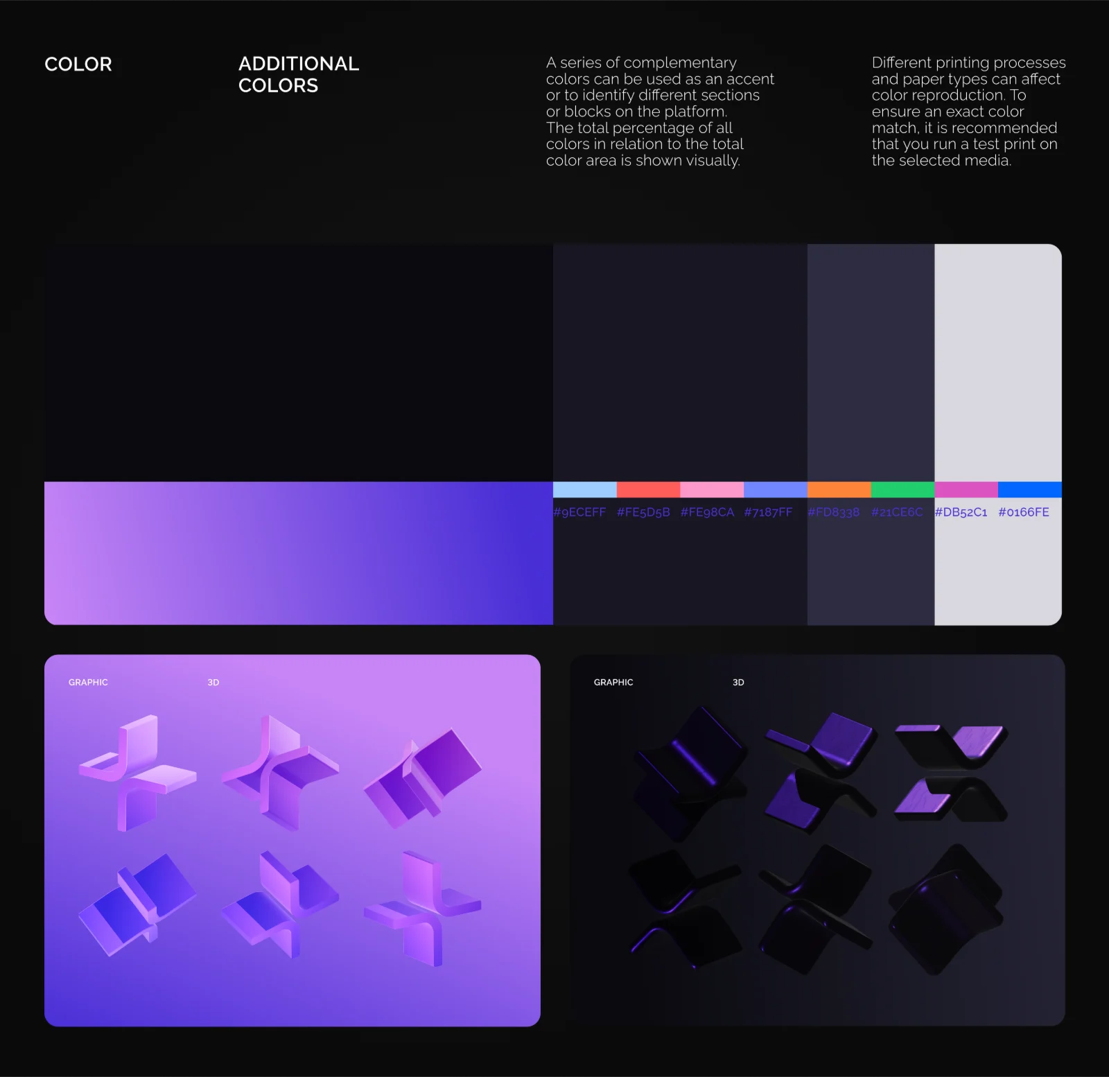
A violet-to-indigo gradient on near-black is the core of the brand. A set of complementary accent colors marks sections and blocks across the platform.
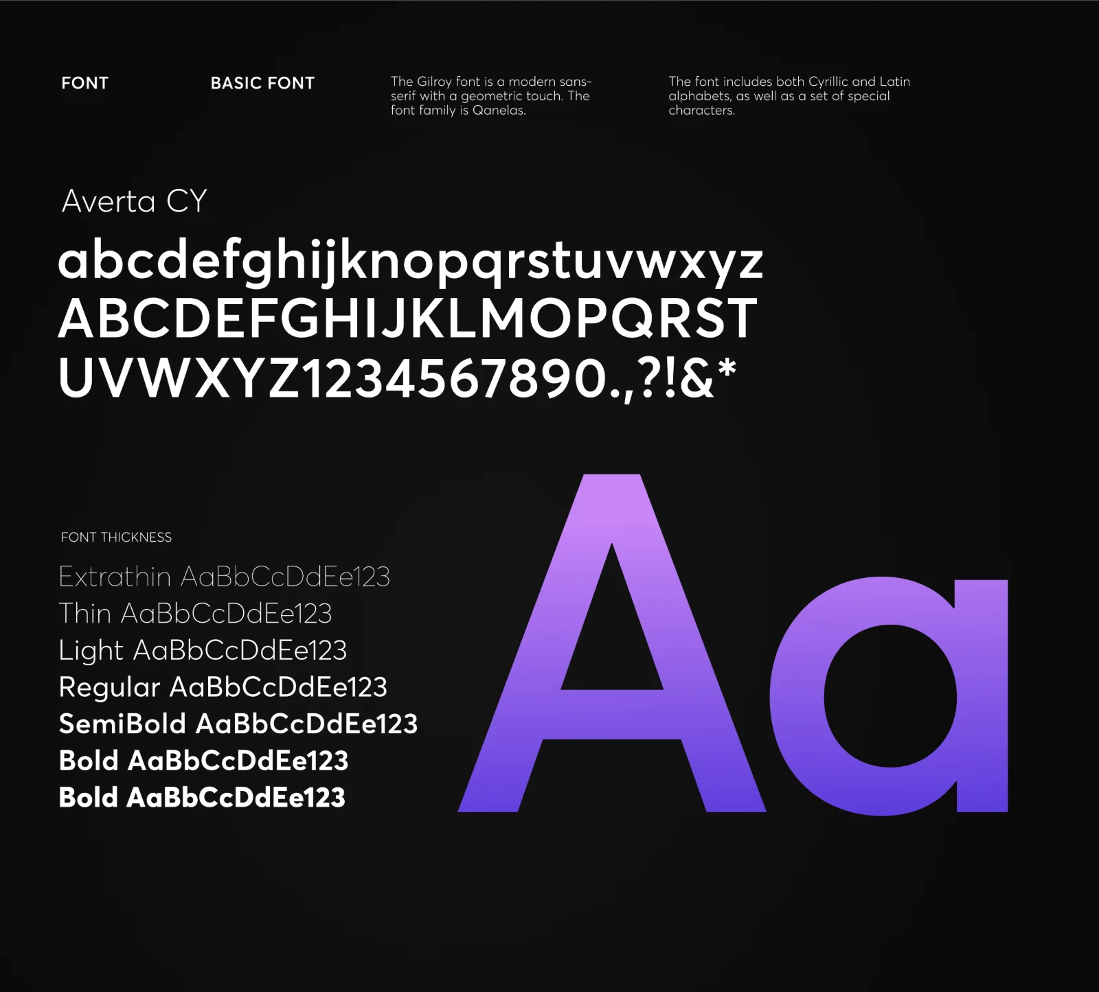
Averta CY, a geometric sans-serif with Cyrillic and Latin alphabets, in weights from Extrathin to Bold.
The same tokens drive the UI kit: cards, charts, tables, status pills, inputs and modals, so every screen is assembled from the same parts.
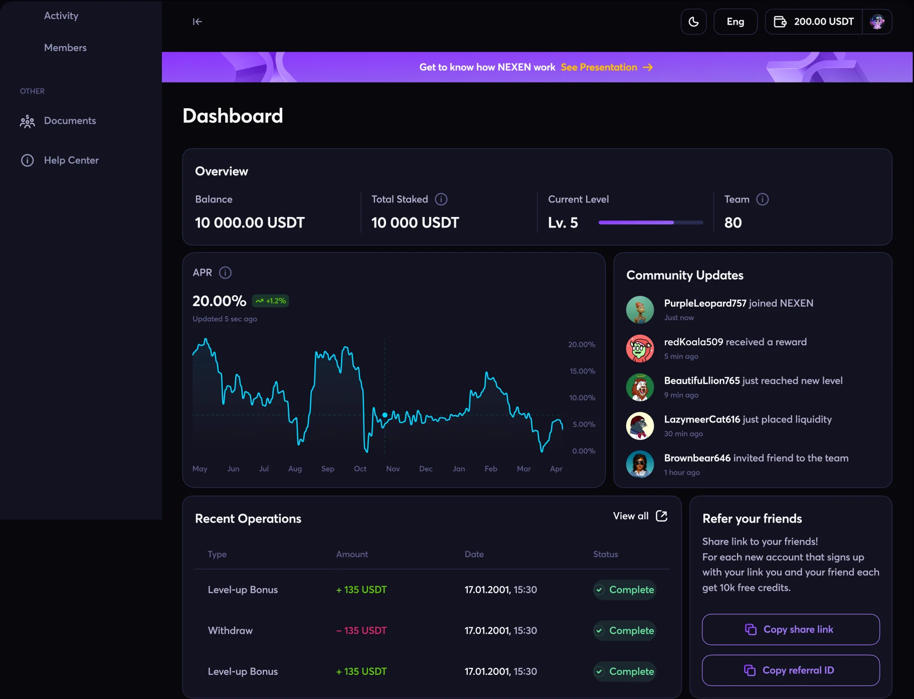
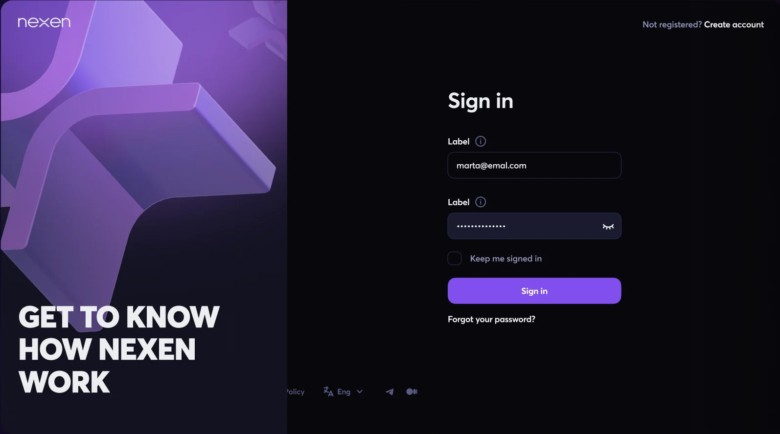
Sign-in with two-step authentication, then a welcome modal that offers a short video or a guided tour. A banner on every page links to a presentation on how Nexen works.
Balance, total staked, level and team size sit up top. Below them: an APR chart, a live feed of community updates, recent operations with clear status pills, and a referral card.
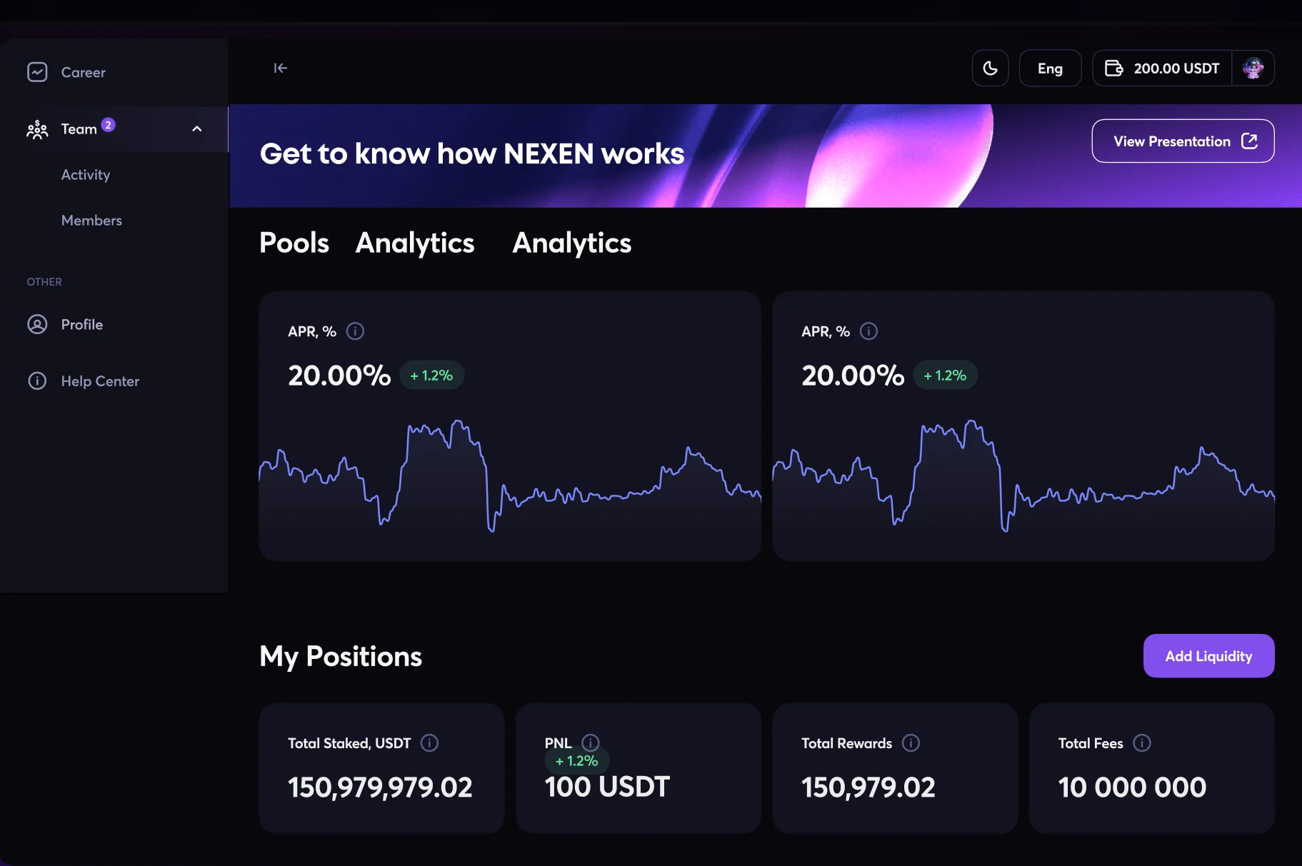
APR charts for each pool and a My Positions summary (total staked, PnL, rewards and fees) with Add Liquidity always one click away.
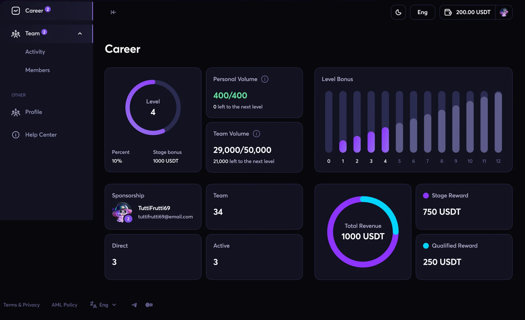
Levels, personal and team volume, a level-bonus chart and revenue rings turn the growth program into progress you can see at a glance.
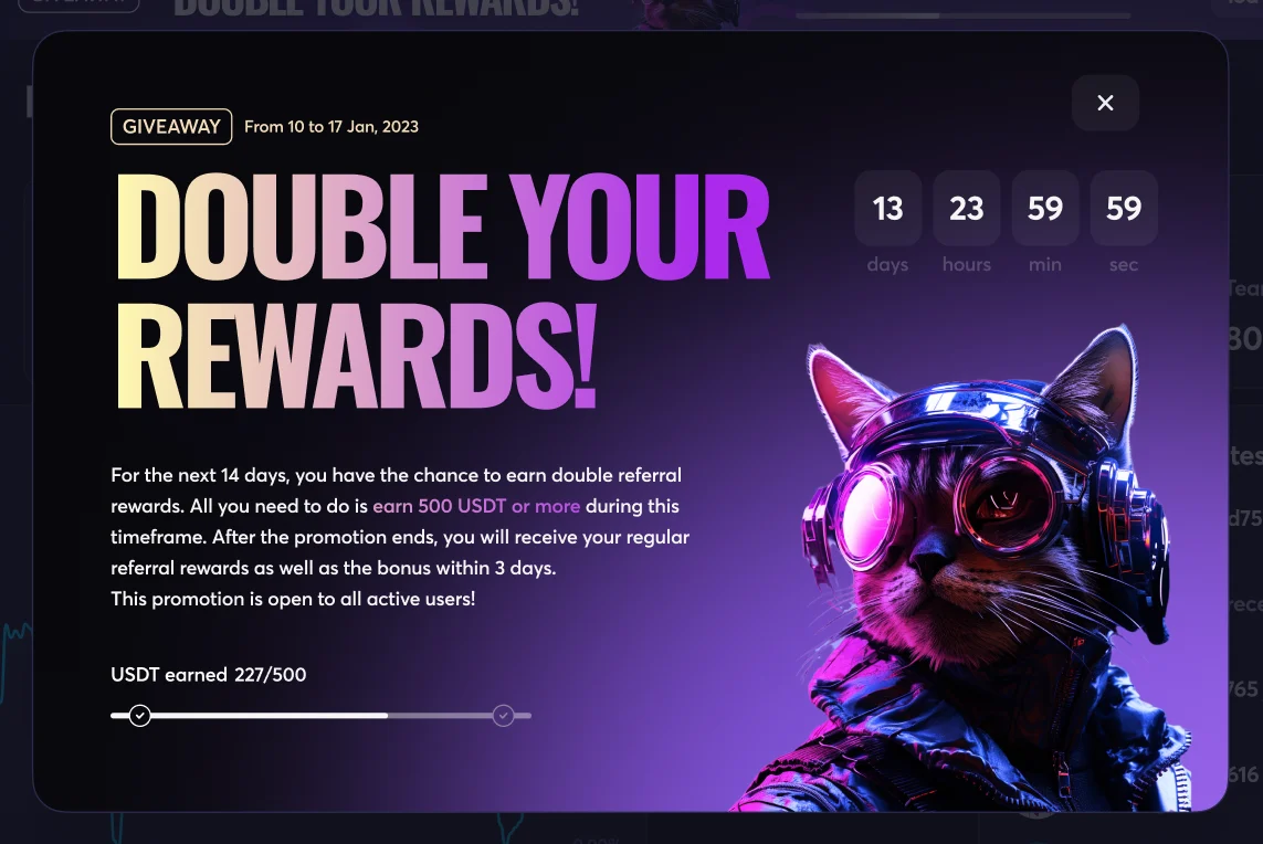
Promotions such as a “Double your rewards” giveaway get their own modal, with a countdown and a progress bar toward the goal.
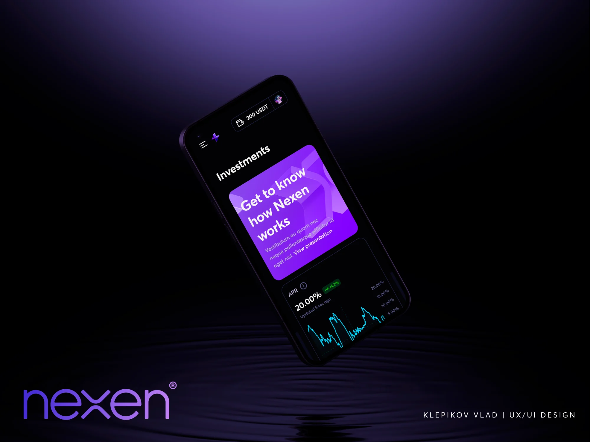
The mobile layouts keep the desktop structure but reflow it for one hand: the balance in the header, the presentation banner as a card, and APR charts sized for a phone.
Because both are built from the same UI kit, a change to a component shows up on web and mobile alike.
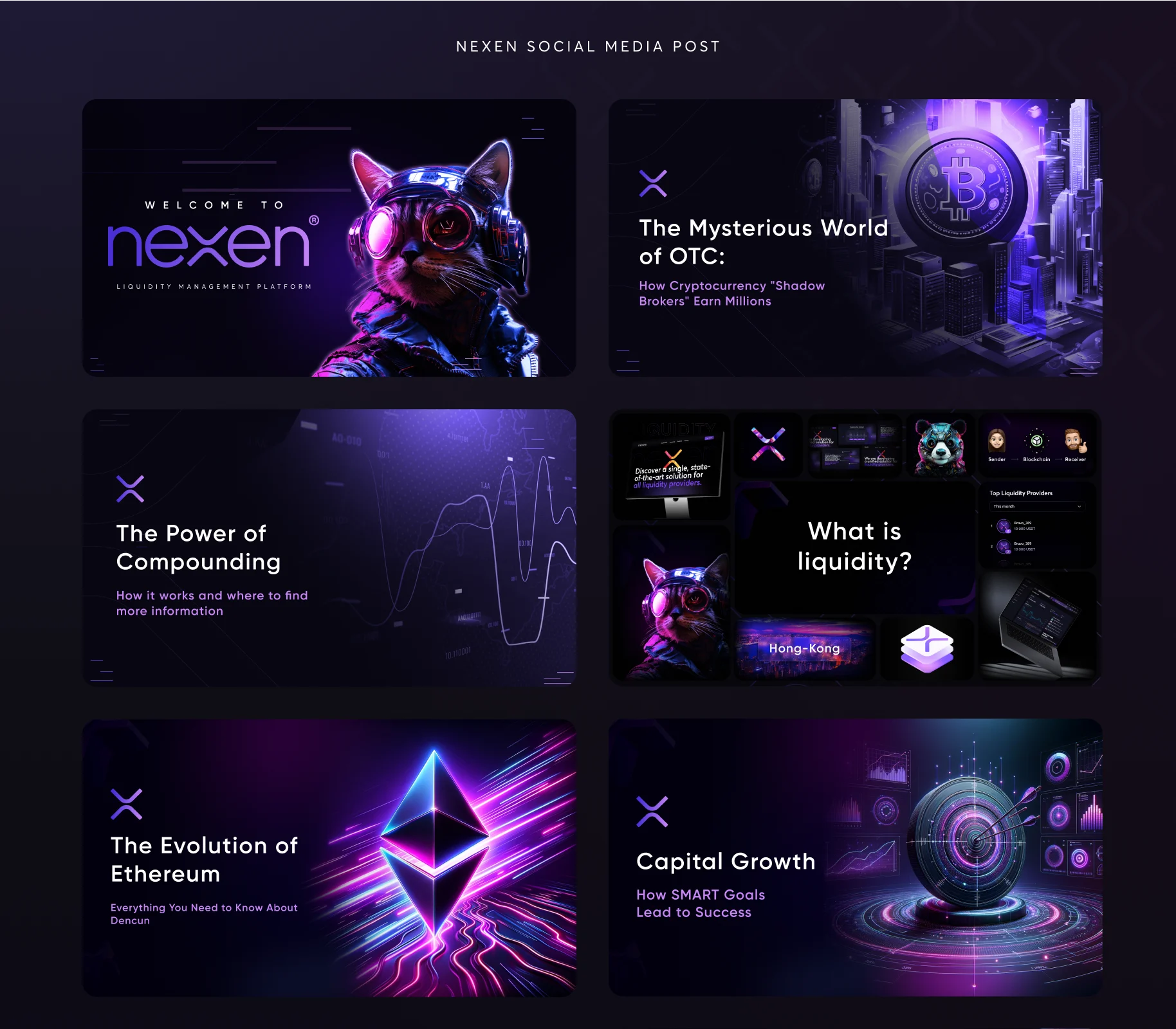
I designed the social media posts and event banners that introduced Nexen: explainers on liquidity, compounding and stablecoins, platform presentation invites and AMA sessions.
Each one uses the same grid, the X mark and the purple 3D graphics, so a post in a feed is recognizably Nexen before anyone reads the copy.
Building the logo, icons and graphics from a single X made the whole system easier to extend and instantly recognizable.
A finance screen is mostly numbers. Size, color and grouping decide which ones a user reads first.
Working as both designer and UI developer kept the UI kit and the shipped interface in step.
Tell me what you’re building. If I’m not the right fit, I’ll tell you that too.
or email hi@klep.dev